Tampilkan postingan dengan label WPF. Tampilkan semua postingan

Rabu, 23 Oktober 2013

How to Create a List of Item, with Multiple Fields: C#

If read more about DataTable, then follow How to Use DataTable in C#.

DataTable is the tabular form of data we are storing. Now to create a list, we have to create a list that can contains our desired set of data. List resides in System.Collection.Generic namespace of visual studio. Let suppose, we have a student class with some common properties like name, age, city, and date of birth.

To create a list, just create a list object type of student as in following line of c# code:
public class Student
{
public string Name { get; set; }
public int Age { get; set; }
public string City { get; set; }
public DateTime Dob { get; set; }
}

And the list object will create by the following line:

List<Student> stuList = new List<Student>();

This list can be used further like to insert new record of student, to bind this list with datagridview, to store temporary data from the database and many more. A list have many in-built functions, we have to just analyse them and use them.

This list is empty by default and can contains student type of data only. To insert some data in this list, we have to create a new object of student and then call the add() method of list. The add() method requires a parameter of student type. The syntax of method to add a new student is:
stuList.Add(new Student()
{
Name = "Jacob",
Age = 29,
City = "London",
Dob = new DateTime(1984, 5, 26)
});

This will add a single record of student with above details. We can add as many record as per our requirement.

In the next post we will use some in-built functions which requires Basics of LINQ language.

Senin, 21 Oktober 2013

Uses of "Using" Statement in C#

Every object consumes some amount of storage in memory, when created by the programmer. Programmer have to dispose all the objects created and empty the storage allocated. This disposing can be done through Dispose() menthod in in-built IDisposable interface, in Visual Studio.

If programmer don’t release the memory, then it can be done by the CLR, according to its decision to perform garbage collection. Using statement allows the programmer to specify, when to release the resources used. The syntax of using statement:
using (ClassName obj = new ClassName())
{
// Line of code to be executed
}

The ClassName denotes the name of class to which the object is created. Obj is the object, which will be disposed at the last of this scope of “using” statement. The following code will create an object of Student class and when the debugger will reached on last line of code, it will release the memory allocated by the stu object.
using(Student stu = new Student())
{
//Line of code to be executed
}

The other reason of exiting the using statement may be an exception in our line of code. When an exception is generated, it will go to catch method, and dispose method will not be called. So we should use this using statement for better memory management.

Jumat, 11 Oktober 2013

How to Use Images in Treeview: WPF

Image control can be placed in any other control such like Treeview, Toolbar control or any other controls. The images can be stored in your solution files. To place an image in Treeview control using following simple steps.

Place a stackpanel with horizontal orientation and look like following structure:
 <StackPanel Orientation="Horizontal" Height="30">
<Label Content="first"></Label>
<Image Source="buttonImage.png"></Image>
</StackPanel>

The XAML code will place a label and an image in a stack panel. Now to use this in treeview control just place it in between the treeview item code.
<TreeView HorizontalAlignment="Left" VerticalAlignment="Top" Margin="5">
<TreeViewItem Header="Item1">
<StackPanel Orientation="Horizontal" Height="30">
<Label Content="first"></Label>
<Image Source="buttonImage.png"></Image>
</StackPanel>
</TreeViewItem>
</TreeView>

A single treeview item will be placed in the WPF window. Now write the following code to place three treeview items each having an image:
<TreeView HorizontalAlignment="Left" VerticalAlignment="Top" Margin="5">
<TreeViewItem Header="Item1">
<StackPanel Orientation="Horizontal" Height="30">
<Label Content="first"></Label>
<Image Source="buttonImage.png"></Image>
</StackPanel>
</TreeViewItem>
<TreeViewItem Header="Item2">
<StackPanel Orientation="Horizontal" Height="30">
<Label Content="second"></Label>
<Image Source="image1.png"></Image>
</StackPanel>
</TreeViewItem>
<TreeViewItem Header="Item3">
<StackPanel Orientation="Horizontal" Height="30">
<Label Content="third"></Label>
<Image Source="image2.png"></Image>
</StackPanel>
</TreeViewItem>
</TreeView>

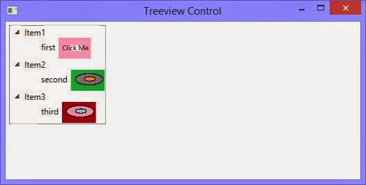
Run the project and expand each of the node of treeview, each node have its label and an image as shown in the following image:

How to use images in Treeview control WPF XAML

See Also: Place an Image in Toolbar

Introduction of WPF TreeView Control

Treeview control is used to display our data in hierarchical form, where some of the nodes are parent and some of them are children of their parents. In the left side of windows explorer there is a treeview containing some libraries, or our computer shortcuts and some favourites.

The parent node can be expanded or collapsed by the user. A simple treeview containing some nodes can be designed by the following XAML code:
<TreeView HorizontalAlignment="Left" VerticalAlignment="Top">
<TreeViewItem Header="Item1"/>
<TreeViewItem Header="Item2"/>
<TreeViewItem Header="Item3"/>
<TreeViewItem Header="Item4"/>
</TreeView>

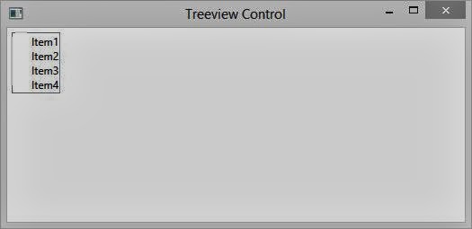
The code will place a treeview contains four items as described in above code. The code specifies that the treeview will placed in the left and top of the window having margin of 5 points as shown in the following image:

How to use Treeview and add some children in WPF XAML

Now we have to add some children for the treeview item added above. Write the following XAML code:
<TreeView HorizontalAlignment="Left" VerticalAlignment="Top" Margin="5">
<TreeViewItem Header="Item1">
<TreeViewItem Header="Child 1"></TreeViewItem>
<TreeViewItem Header="Child 2"></TreeViewItem>
</TreeViewItem>
<TreeViewItem Header="Item2">
<TreeViewItem Header="Child 1"></TreeViewItem>
<TreeViewItem Header="Child 2"></TreeViewItem>
</TreeViewItem>
<TreeViewItem Header="Item3">
<TreeViewItem Header="Child 1"></TreeViewItem>
<TreeViewItem Header="Child 2"></TreeViewItem>
</TreeViewItem>
</TreeView>

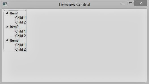
Run the project and it will show three parent nodes, each contains two children, as shown in the following image:

How to use Treeview and add some children in WPF XAML

Like above children we can add more children to the parent node and a children can also have its children. The same process will follow up to add nested nodes.

See Also: How to use Treeview in Windows Forms

Kamis, 10 Oktober 2013

How to Load UserControl in ToolBar Control: WPF

In earlier post I have placed some images and labels in toolbar control using some lines of XAML code. Now if we want to load a user control, written in another file, we have so follow some steps like the below.

Just add a user control through “Add New Item” from the file menu or from the right click on the project. Rename it if you want and write the following XAML code to add two labels and two textbox in this user control:
<StackPanel Orientation="Horizontal">
<Label Content="Name"></Label>
<TextBox Width="50"></TextBox>
<Label Content="Age"></Label>
<TextBox Width="40"></TextBox>
</StackPanel>

Now open our WPF window and add a reference of our current project (or the project which contains our user control), just like using:

xmlns:uc="clr-namespace:WpfApplication1"

Now write the following line of XAML code in the main content of the window:
<ToolBar Name="toolbarControl">
<uc:UserControl1></uc:UserControl1>
</ToolBar>

Run the project and the toolbar control will be load with the above user control.

How to load user control in toolbar control: WPF XAML

How to Place an Image in Toolbar Control: WPF

Toolbar control is used to place some shortcuts in the windows environment. We can use this toolbar in our WPF application as used in our previous post. In this post, we will place an image control in to this toolbar.

We can directly place the image or we can use a stack panel to use an image. Just write the following XAML code:

<ToolBar VerticalAlignment="Bottom">
<StackPanel Orientation="Horizontal">
<Label Content="Image 1"></Label>
<Image Source="buttonImage.png" Width="80" Height="40"></Image>

<Label Content="Image 2"></Label>
<Image Source="image1.png" Width="80" Height="40"></Image>
</StackPanel>
</ToolBar>

Run the above code and it will place two label control with two images respectively. These two images are placed in my solution files. The images are fix proportionally according to the width and height provided.

How to place an image control in ToolBar Control: WPF XAML


The same process may be done by the c# code (through code behind file). We can use as many images as we want to use in a single toolbar control. In the next article we will load a user control in this toolbar control.

See Also: How to Load UserControl in Toolbar Control

Selasa, 08 Oktober 2013

How to Use ToolBar Control: WPF

Toolbar control is a container control, that can contains other types of controls like labels, buttons even other containers. In our windows environment, there is also a toolbar which contains our shortcut buttons with images. Wherever we want to go in computer, we can go through a single click on the toolbar’s buttons.

<ToolBar Header="Header of Toolbar Control"/>

The above line of XAML code will place a toolbar control with the header text. The header text will be the above text i.e. “Header of Toolbar Control”. The following image shows the toolbar control:

How to use ToolBar control in WPF XAML

In the right side of this toolbar there is a symbol down arrow key which provides an overflow mechanism. This mechanism is used, when there are more items to fit in the control, to place those items in this overflow area.
<ToolBar VerticalAlignment="Bottom">
<Button Content="File"></Button>
<Button Content="Edit"></Button>
<Button Content="View"></Button>
<Button Content="Help"></Button>
</ToolBar>

Just analyse the above XAML code, it contains four buttons like a simple menu bar. These buttons will be shown in the toolbar control without using the overflow area.

How to use ToolBar control in WPF XAML

Now, if we want to use that overflow area then just decrease the width of this control as I do in following XAML code.
<ToolBar VerticalAlignment="Bottom" Width="150">
<Button Content="File"></Button>
<Button Content="Edit"></Button>
<Button Content="View"></Button>
<Button Content="Help"></Button>
<Button Content="Height"></Button>
<Button Content="Width"></Button>
<Button Content="Margin"></Button>
</ToolBar>

Using this code it will show four buttons by default, and the last three button in the overflow area. It means when we have some more items to be used, then those items will placed on that overflow area.

How to use ToolBar control in WPF XAML

Minggu, 29 September 2013

How to Make TextBox Control ReadOnly: WPF

In our previous post, we have enable the spell check feature of the textbox, through which user can check the spellings of the word entered and correct it. As we know that the textbox is used to input any value by the user, but it can be used to display fix text on the screen.

To display fix text that cannot be edited by the user, we have to make the textbox read-only. The textbox have a property IsReadOnly, that is set to be true to enable this feature. Just write the following XAML code snippet:
<TextBox Width="300" Height="25" Margin="5"
Text="This is the correct line and you cannot edit it."
 IsReadOnly="True">
</TextBox>
Now run the code and a textbox will display with the above text written. The thing to check is, this textbox have its fix text and the user can not vary that text.

How to make read-only textbox in WPF XAML

So the read-only property is used to make the textbox read-only for the users. We can validate the input entered by the user by writing some line of code in our code part. We will validate the input in our next article.

Rabu, 25 September 2013

How to Enable Spell Check in TextBox: WPF

WPF Textbox control is used to input some value by the user at run time. Now it is not sure that the entered values are correct, it means user can write anything wrong in the textbox. So it is programmer’s job to check the value and correct it if wrong.

WPF textbox control provides a spell check functionality something same as MS Word. We have to use SpellCheck and Language property of the textbox. SpellCheck will enable the feature and language will decide the language in which spell check is to be performed.

<TextBox Width="300" Height="25" Margin="5"
Text="This si not teh correct line written by teh usre"
SpellCheck.IsEnabled="True" Language="En-Us">
</TextBox>

The code above will show a textbox with the given text. According to US English language, the textbox will place some red lines on the wrong words, as shown in the following image.

Enable SpellCheck in WPF Textbox Control


As in MS Word, when we right click on the wrong word, then it will show some help options in the context menu, as shown in the following image:

Show Context Menu in WPF Textbox control spell check

Selasa, 24 September 2013

How to Use TextBox Control in WPF

The previous controls i.e. Label, TextBlock and etc. are used to display fix text in a window. Their text can be changed but through the programming, not by the user. Now to input some value by the user, or enable text editing, the text box control is used. The textbox control can contain only unformatted text in its text property.

<TextBox Width="200" Height=”25” Text="WPF Textbox control"></TextBox>

The above code will place a textbox control having width two hundred and above text in the textbox. The textbox is shown in the following image:

How to use Single line textbox in WPF XAML


In the above textbox only one line can be written, means we can’t either enter a new line in to the textbox or cant inset more lines by default. To enable multiline, it have two properties to do that i.e. TextWrapping and AcceptReturn. To insert a multiline textbox, write following code:

<TextBox Width="200" Height="40" Margin="5" Text="WPF Textbox control" TextWrapping="Wrap" AcceptsReturn="True"></TextBox>

Now when we run and write some more lines, then it will show something like this:

How to use Multiline textbox control in WPF XAML


In the next post we will enable spell check for this textbox control.

Sabtu, 21 September 2013

TextBlock Control Introduction: WPF

According to previous post, Label control derives from Content Control and can: display other type of data as well as string, perform all the functions of a content control. There are some drawbacks in label control such as it cannot support multi line texts.

Textblock control is derived from Framework Element, and can display string type of data only. It has a property TextWrapping which is used to display our text in multiple lines. Means text block can be used to display paragraphs in WPF. A textblock can be drawn in XAML code with below line:

<TextBlock Text="text block" Width="200"/>

It will show the above text in the width specified. If we want to show some more text, then we have to use TextWrapping property of this textblock. If we don’t enable text wrapping then it will only show the text that can be shown in specified width.
<TextBlock Text="Textblock control is derived from Framework
Element, and can display string type of data only.
It has a property TextWrapping which is used to
display our text in multiple lines. Means text
block can be used to display paragraphs in WPF"
Width="200" TextWrapping="Wrap"/>

Now when we run this code, it will show the text written above. The width will be fixed as 200 and height will be increased according to the given text.

How to use TextBlock Control in WPF XAML

If we also specified height here, then the text will not be shown. Just placed the height as 200 here and check out the output as:

Use TextBlock Control with Height in WPF XAML

Rabu, 18 September 2013

How to Place Items in TabControl: WPF

In our previous post, we have learnt about tab control and place some tabs into that control. In this post we will place a container, means we will place a simple entry form into a tab item. As we all know the entry form can contain name, age, address or some more basic information about a person.

So I am taking only name and age here as for example. Just write the following code in our XAML code window:
<TabControl Name="tabControl" Margin="5">
<TabItem Header="Entry Form Tab">
<Grid>
<Grid.ColumnDefinitions>
<ColumnDefinition Width="100"/>
<ColumnDefinition Width="200"/>
</Grid.ColumnDefinitions>
<Grid.RowDefinitions>
<RowDefinition Height="30"/>
</Grid.RowDefinitions>
<Label Content="Name"/>
<Label Content="Age" Grid.Row="1"/>

<TextBox Margin="2" Grid.Column="1"></TextBox>
<TextBox Margin="2" Grid.Column="1" Grid.Row="1"></TextBox>
</Grid>
</TabItem>
</TabControl>


Just run the code and a tab control is placed on our window with an entry form. The form will look like the following image:

How to customize tab control in WPF and XAML

So we have simply placed an entry form into tab item. We can set anything as the content property of tab item, just as above code.

In the above code, i have modify only a single tab item for example. If you need more tabs then you can modify as many tabs as you want to.

How to Create Tabs using TabControl: WPF

When there is not much space on our screen then programmer uses a tab control. Tab control is used to organize multiple tabs on WPF window, which can performs individual function decided by the programmer. It can contains collection of objects of any type i.e. string, image or a container.

Through XAML, we can place a tab control easily using the element Tab Control. To place some tabs into tab control, we have to use TabItem elements. Write the following code in your XAML:
<TabControl Name="tabControl" Height="400" Width="300" Margin="5">
<TabItem Header="Tab 1" Width="70"></TabItem>
<TabItem Header="Tab 2" Width="70"></TabItem>
<TabItem Header="Tab 3" Width="70"></TabItem>
</TabControl>

Now run the code and check out the tab control. It have three tabs with their own header as described above.

How to add a Tabcontrol in XAML and WPF


The same tab control can also be generated through the following code in C# code behind file:
TabControl tabcontrol = new TabControl();
tabcontrol.Name = "tabControl";
tabcontrol.Height = 400;
tabcontrol.Width = 300;
tabcontrol.Margin = new Thickness(5);

TabItem tabItem1 = new TabItem();
tabItem1.Header = "Tab 1";
tabcontrol.Items.Add(tabItem1);

TabItem tabItem2 = new TabItem();
tabItem2.Header = "Tab 2";
tabcontrol.Items.Add(tabItem2);

TabItem tabItem3 = new TabItem();
tabItem3.Header = "Tab 2";
tabcontrol.Items.Add(tabItem3);

this.Content = tabcontrol;

In next article, we will place some items/containers in these tab items. The containers could have other items/containers.

Senin, 16 September 2013

How to Bind ComboBox with DataTable: WPF

DataTable is an object of ADO.NET library, which is used to store temporary data in tabular form in memory. When we are creating data table in code part, then we have to add some columns and have to add some rows.

We have learnt about the combo box introduction and its binding with the list of string in our earlier posts. In this article we will bind this combo box to a data table. Just add a combo box and write some properties as in below code:
<ComboBox Name="cmbBox" Height="25" Width="200"
ItemsSource="{Binding}"></ComboBox>

Now in code part, create an object of data table and add three columns i.e. Name, Age and Address, like in below c# code:
DataTable dt = new DataTable();
dt.Columns.Add("Name");
dt.Columns.Add("Age");
dt.Columns.Add("City");

After adding columns, now its time to add some rows and insert some records in that. So write the below c# code in code part to add three rows:
DataRow dr = dt.NewRow();
dr["Name"] = "Jacob";
dr["Age"] = 25;
dr["City"] = "France";
dt.Rows.Add(dr);

DataRow dr1 = dt.NewRow();
dr1["Name"] = "Julia Martin";
dr1["Age"] = 26;
dr1["City"] = "France";
dt.Rows.Add(dr1);

DataRow dr2 = dt.NewRow();
dr2["Name"] = "Brandon";
dr2["Age"] = 24;
dr2["City"] = "London";
dt.Rows.Add(dr2);

We have successfully created a data table with three columns and add three rows with some valid data. To bind this data table to above combo box, we have to write these two lines in c# code part:

cmbBox.DataContext = dt;
cmbBox.DisplayMemberPath = dt.Columns[0].ToString();

The first line will assign the data context of combo box to the data table, while the second line will set the column name to be displayed in combo box. Run the project the check the combo box:

How to bind combo box with data table in WPF C#, XAML

How to Customize Status Bar in WPF

In earlier post, we have learnt about placing a status bar and add some items on that. WPF provides some advanced options with status bar i.e. we can add some more items or even containers in status bar. In this article we will add a stack panel, image and some more items in a status bar.

Just write the following code in our XAML code window:
<StatusBar Name="statusBar" VerticalAlignment="Bottom">
<StackPanel Orientation="Horizontal">
<StackPanel>
<StatusBarItem Margin="5" >Status 1</StatusBarItem>
<StatusBarItem Margin="5" >Status 2</StatusBarItem>
<StatusBarItem Margin="5" >Status 3</StatusBarItem>
</StackPanel>
<Image Margin="5" Source="wall.jpg" Width="100" Height="30"></Image>
<ProgressBar Width="150" Height="20" Name="progressBar" Value="45"
HorizontalAlignment="Right" Margin="5"></ProgressBar>
</StackPanel>
</StatusBar>

Run the project and it will show a window with three strings in a stack panel, an image and a progress bar. The first stack panel also contain a nested stack panel. These items are added just for example, not for any purpose.

Customize status bar in WPF


Just like the above code, we can place any control in the status bar, according to our requirements.

Status Bar Control: WPF

As the name implies, this control is used to show the status of our progress in our application. The status may be like line/column no. in Notepad, page no. in MS Word, or some text in visual studio. It is very easy to add a status bar in our WPF applications.

Just drag-n-drop the Status bar control on the window, it will display a horizontal bar on the window. It can contains strings, images or other containers like panels. A single item can be added using StatusBarItem in the control. The following XAML code will be used to add a status bar in a window.
<StatusBar Name="statusBar" VerticalAlignment="Bottom">
<StatusBarItem Name="statusBarItem">Value Inserted</StatusBarItem>          
</StatusBar>

In the above code the status bar has been placed on bottom by using VerticalAlignment property. When we run the code, it will add a status bar as shown in following image:

status Bar control introduction in WPF

To add a progress bar control with above string, just use the following code:
<StatusBar Name="statusBar" VerticalAlignment="Bottom">
<StatusBarItem Name="statusBarItem">Value Inserted</StatusBarItem>
<ProgressBar Width="150" Height="20" Name="progressBar" Value="45"
HorizontalAlignment="Right"></ProgressBar>
</StatusBar>

When we run the code, it will display a string on left with a progress bar on right side of the window.

Status bar control with string and progress bar in WPF

Jumat, 13 September 2013

How to Customize ToolTip Control: WPF

As in previous post, we have discussed about the tooltip control or tooltip property of the WPF controls. We can customize this tooltip according to our requirements. As in windows operating system, some controls use a rectangle in its tooltip service.

The following code will use a stack panel control in the tooltip of button. The stack panel have two textboxes and an image displayed in the screenshot shown below.
<Button Margin="5" Content="Submit" Width="200" Height="30">
<Button.ToolTip>
<StackPanel Width="180" Height="150">
<TextBlock Margin="2" Text="Introduction of Button" Background="Aqua" Foreground="Red"/>
<Image Margin="2" Source="wall.jpg" Height="100"></Image>
<TextBlock Margin="2" Text="For more help click F1" Background="BlueViolet" Foreground="Azure"/>
</StackPanel>
</Button.ToolTip>
</Button>
Run the project and a button will show, when we hover the mouse on it then the tooltip will display. Look out the following image:

How to Customize ToolTip control in WPF, XAML


Tooltip service have its open and close events to act on appearing and disappearing of the tooltip. It have some special properties to be used mostly by the programmer.

  • ShowDuration: to specify the duration till the tooltip will be shown. It is in millisecond.
  • ShowOnDisable: it enable or disable the tooltip when the control is disabled.
  • Placement: to place the tooltip on desired direction. It may be left, right, bottom, absolute and some more.
  • HasDropShadow: enable or disable the drop shadow effect of tooltip.

Some more properties are there, but can be used as per need.

How to Use ToolTip Control: WPF

In windows, when we hover our mouse on anything (may be an icon, button and etc.) that we are using, then a message displays. That message contains some information about that thing. That message is called tooltip of that thing, which can be enable using the tooltip service of programming.

Just use the below XAML code and a button is placed on the window.
<Button Margin="5" Content="Submit" Width="200" Height="30">
<Button.ToolTip>
Submit your data by Click
</Button.ToolTip>
</Button>

When we hover our mouse on the button, it will show a tooltip (shown in image) containing about the button.

Enable tooltip for the controls in WPF and XAML

Every control automatically has its tooltip property just like the above button. Whatever the tooltip contains becomes the content of that tooltip.

Kamis, 12 September 2013

How to Use Radio Button in: WPF

This is another control derives from the Toggle Button. It has a different in-built feature that the toggle button doesn’t have. That feature is mutual exclusion, it means if 2 or more radio buttons are grouped together on a form/user control, then only one can be checked at a time. User cant checked multiple radio buttons.

When we check a radio button, all others got unchecked in a single group. Following code will show three radio buttons having individual state:
<RadioButton Margin="5" Name="radioButton1" IsChecked="True" Content="Checked"></RadioButton>
<RadioButton Margin="5" Name="radioButton2" IsChecked="False" Content="UnChecked"></RadioButton>
<RadioButton Margin="5"  Name="radioButton3" IsChecked="{x:Null}" Content="InDeterminate"></RadioButton>

Run the above code and it will display three radio buttons displayed in the following image:

How to use Radio Button in WPF

As the toggle button, it has also IsThreeState property for enable its all three states to be used. To group more than radio buttons we have to specify the same GroupName for all the radio buttons.

To show some text with a radio button, we have to use content property as used in above code.

How to Use Toggle Button: WPF

Toggle button is a sticky button, which have two states i.e. checked and Unchecked by default. It don’t have cancel behaviours of the button. Clicking this first time will set IsChecked property to true, and second time clicking will set IsChecked property to false.

The following XAML code will show two toggle buttons with IsChecked property true and false respectively. As the checkbox button, toggle button also have IsThreeState property means it have three states i.e. checked, unchecked and indeterminate.
<ToggleButton Margin="5" Height="20" Width="100" IsChecked="True"/>
<ToggleButton Margin="5" Height="20" Width="100" IsChecked="False"/>

When we want to use the third state, then the value of IsChecked will be {x:Null} and it will also look like false value. The above code will show the window with two toggle button like following image:


To use third property we have to set IsThreeState property to true. Now first click set the IsChecked to true, second will set null and third will set to false. It have individual event for all the three states:
private void ToggleButton_Checked(object sender, RoutedEventArgs e)
{
}

private void toggleButton_Unchecked(object sender, RoutedEventArgs e)
{
}

private void toggleButton_Indeterminate(object sender, RoutedEventArgs e)
{
}