Sabtu, 31 Agustus 2013

How to Use Calendar Control: WPF

To select a date in our client application, enter the date into a textbox and then convert it to the particular class i.e. DateTime. What, if there is an in-built control to select a date, month and a year also. Calendar control is used to do these task and look like the following:

Display Modes of Calendar Control in WPF

The image shows three display modes of this calendar control i.e. month, year and decade respectively. By default it is Month view (the first view). User can switch the view to click on month and then year and so on. It have some commonly used properties which are:

DisplayDate: To specify the displayed date in the calendar control. Assign the date in the system date format.

SelectedDate: change the currently selected date. Used as the display date. If the control shows the old date we can change it to current using following code:
<Calendar SelectedDate="{x:Static sys:DateTime.Now}"/>

SelectionMode: it provides multiple modes for selection like “MultipleRange”. We can select a range of dates by using this property.

BlackoutDates: this control provides a feature of black out some dates means user cannot select some of the date blocked by system.
<Calendar>
<Calendar.BlackoutDates>
<CalendarDateRange Start="08.04.2013" End="08.04.2013"/>
<CalendarDateRange Start="08.16.2013" End="08.24.2013"/>
</Calendar.BlackoutDates>
</Calendar>
It will cross all the dates specified in the above range as shown in the following image:

Blackout Dates in Calendar Control: WPF

DisplayMode: to change the display modes i.e. year, month and decade as in our first diagram.

Like other controls it also have many events like selectedDatesChanged, displayDateChanged, displayModeChanged and etc. We can specify the actions to be performed at the particular event. Calendar control can be customizable as per the requirement of the user like background and foreground.

See also: Button Control

Ways to Use Button Control: WPF

Button, a simple and small name to listen in all the programming languages. All the windows, forms, dialog boxes and even user controls mostly use this button to be performed some action. Open, close, submitting a form and whatever to do can also be performed by button.

Button control is of content control type, means it have a content property to be assigned by us. The content may be a string or anything that can be used under the conditions.

<Button Name=”loginButton” Content=”Click to Login”></Button>

The above button will look like a standard button control and saying the user to click if he/she want to login. Actually, it only have its content property, doesn’t have defined any action to be performed when user will click. So click event have to be defined to perform an action when user click on it.

<Button Name="loginButton" Content="Click to Login" Click="loginButton_Click"></Button>

In the code behind file the click event is generated like the following code in C# language
private void loginButton_Click(object sender, RoutedEventArgs e)
{
MessageBox.Show("You are logged in");
}
The message box is not pre-defined. When user click on the button it will show the above message each time. We can bind our button to the commands defined in a class to be performed the same action as in click event. The following code is used to bind a button to a command.

<Button Name="loginButton" Content="Click to Login" Command="{Binding ClickCommand}"></Button>

The command can be simply defined as the below code in C# language:
public ICommand ClickCommand
{
get
{
return showDetailCommand;
}
}
ICommand is the interface that is used for this command binding. We will learn it later. We can use a button as per our requirements using its properties.

How to use Panel Control in ASP.NET

The Panel Control

The Panel control is one of the most frequently used controls. It creates a borderless division on the form, by using this division one can place the controls inside this control. This control exists within System.Web.UI.WebControls namespace. The panel control are useful when you want to show or hide a group of controls at once or when you want to add controls to a Web page through code.

How to change panel background color dynamically

When you add a panel control on a Web page (panelcontrol.aspx), it adds the following code to the source code of the Web page.
<asp:Panel ID="Panel1" runat="server"></asp:Panel>
In this example , we have placed two panel controls on the Web page. The first control contains two RadioButton controls showing color options on the button Control's click event. The second Panel control displays the color selected by any of the RadioButton control.


<%@ Page Language="C#" %>
<!DOCTYPE html>
<script runat="server">


    protected void Button1_Click(object sender, EventArgs e)
    {
        string s = string.Empty;
        if (RadioButton1.Checked)
        {
            s = RadioButton1.Text;
            Panel2.Attributes.Add("Style", "BackGround-Color:" + s);
        }
        else
        {
            s = RadioButton2.Text;
            Panel2.Attributes.Add("Style", "BackGround-Color:" + s);
         
        }
     

    }
</script>

<html xmlns="http://www.w3.org/1999/xhtml">
<head runat="server">
    <title></title>
</head>
<body>
    <form id="form1" runat="server">
    <div>
        <asp:Panel ID="Panel1" runat="server">
            <asp:RadioButton   ID="RadioButton1" runat="server" Text="Red" AutoPostBack="True" GroupName ="c1" />
            <asp:RadioButton ID="RadioButton2" runat="server"  Text="Green" AutoPostBack="True" GroupName ="c1" />


            <br />
            <asp:Button ID="Button1" runat="server" OnClick="Button1_Click" Text="Change Color" />
            <br />


        </asp:Panel>
    </div>
        <asp:Panel ID="Panel2" runat="server">
            Panel-color changed</asp:Panel>
    </form>
</body>
</html>

Output
How to change panel background color dynamically

Jumat, 30 Agustus 2013

ASP.NET: Total list item count in DropDownlist

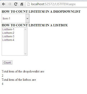
Example of count List Item


<%@ Page Language="C#" %>
<!DOCTYPE html>
<script runat="server">
    protected void Button1_Click(object sender, EventArgs e)
    {
        string s = "Total item of the dropdownlist are<br/>";
        s = s + DropDownList1.Items.Count;
        string s1 = "Total item of the listbox are <br/>";
        s1 = s1 + ListBox1.Items.Count;
        Label1.Text = s + "<br/>" + s1;
       
    }
</script>

<html xmlns="http://www.w3.org/1999/xhtml">
<head runat="server">
    <title></title>
</head>
<body>
    <form id="form1" runat="server">
    <div>
        <strong>HOW TO COUNT LISTITEM IN A DROPDOWNLIST</strong>
        <br />
        <asp:DropDownList ID="DropDownList1" runat="server" Height="46px" Width="133px">
            <asp:ListItem>Item-1</asp:ListItem>
            <asp:ListItem>Item-2</asp:ListItem>
        </asp:DropDownList>
        <br />
        <strong>HOW TO COUNT LISTITEM IN A LISTBOX<br />
        </strong>
        <asp:ListBox ID="ListBox1" runat="server" Height="136px" Width="123px">
            <asp:ListItem>ListItem-1</asp:ListItem>
            <asp:ListItem>ListItem-2</asp:ListItem>
            <asp:ListItem>ListItem-3</asp:ListItem>
            <asp:ListItem>ListItem-4</asp:ListItem>
        </asp:ListBox>
        <br />
        <br />
        <asp:Button ID="Button1" runat="server" OnClick="Button1_Click" Text="Count" />
        <br />
        <br />
        <asp:Label ID="Label1" runat="server"></asp:Label>
        <br />
        <br />

    </div>
    </form>
</body>
</html>

Output
ASP.NET: Total list item count in DropDownlist

How to change forecolor and backcolor dynamically of dropdownlist in ASP.NET

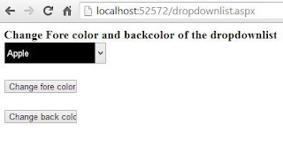
ForeColor and BackColor Change Dynamically

Using the color property you can change your appearance of the Control. Looks is matter for any website if you do something different for your visitor or registered user. Your website visitor want that no one text hidden on the website.
ForeColor : This is the TextColor which is appear in the DropDownlist .
BackColor : This is the BackGround color.
Example of the dynamically change forecolor and backcolor
<%@ Page Language="C#" %>
<!DOCTYPE html>
<script runat="server">
    protected void Button1_Click(object sender, EventArgs e)
    {
        DropDownList1.ForeColor = System.Drawing.Color.White;
     
    }
    protected void Button2_Click(object sender, EventArgs e)
    {
        DropDownList1.BackColor = System.Drawing.Color.Black;
    }
</script>

<html xmlns="http://www.w3.org/1999/xhtml">
<head runat="server">
    <title></title>
    <style type="text/css">
        .auto-style1 {
            font-size: large;
        }
    </style>
</head>
<body>
    <form id="form1" runat="server">
    <div>
 
        <span class="auto-style1"><strong>Change Fore color and backcolor of the dropdownlist
        <br />
        </strong>
        <asp:DropDownList ID="DropDownList1" runat="server" Height="34px" Width="157px">
            <asp:ListItem>Apple </asp:ListItem>
            <asp:ListItem>Mango</asp:ListItem>
            <asp:ListItem>Orange</asp:ListItem>
        </asp:DropDownList>
        <br />
        <br />
        </span>
        <asp:Button ID="Button1" runat="server" OnClick="Button1_Click" Text="Change fore color" Width="112px" />
        <br />
        <br />
        <asp:Button ID="Button2" runat="server" Text="Change back color" Width="112px" OnClick="Button2_Click" />
        <br />
 
    </div>
    </form>
</body>
</html>


Output
How to change forecolor and backcolor dynamically of dropdownlist in ASP.NET

How to use Table Control in ASP.NET

The Table Control

The Table control helps create a table. The control is useful when you want to present data in a tabular format. This control exists within the System.Web.UI.WebControls namespace. Web designers often use tables for the right placement of elements in Web pages. You can create a Table at design-time or runtime, depending on The requirement of the project.

Public Properties of the Table Class

Caption : Obtains or sets the text to render in an HTML caption element in a Table control.
GridLines : Obtains or set the grid line style to display in the Table control

 Example of the Table Control in ASP.NET

1. Add table rows to the Table Control with the help of the TableRow Collection Editor dialog box by selecting the Table control in the design-mode and clicking the ellipse(...) button in front of its Rows properties in the Properties window.
Table Rows Collection


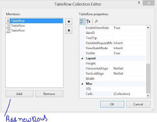
2. For adding new table rows to the Table control, click the Add button in the TableRow Collection Editor dialog box.
Create Table Rows
3. To add Table cells to a table row, click the ellipsis (...) button in front of its cells property on the right side of the TableRow Collection Editor dialog box.
Create Cells in selected Table rows
4. For adding Table cells to a table row, click the Add button . You can set the Text to be displayed in a table cell by setting its Table property on the right side of the TableCell Collection Editor dialog box.
Add Cell Text

Example of How to use Table Control in ASP.NET


<%@ Page Language="C#" %>

<!DOCTYPE html>

<script runat="server">

</script>

<html xmlns="http://www.w3.org/1999/xhtml">
<head runat="server">
    <title></title>
</head>
<body>
    <form id="form1" runat="server">
    <div>
 
        <asp:Table ID="Table1" runat="server" GridLines="Both">
            <asp:TableRow runat="server">
                <asp:TableCell runat="server">Id</asp:TableCell>
                <asp:TableCell runat="server">Name</asp:TableCell>
                <asp:TableCell runat="server">Address</asp:TableCell>
            </asp:TableRow>
            <asp:TableRow runat="server">
                <asp:TableCell runat="server">1</asp:TableCell>
                <asp:TableCell runat="server">Dotprogramming</asp:TableCell>
                <asp:TableCell runat="server">Chirawa </asp:TableCell>
            </asp:TableRow>
            <asp:TableRow runat="server">
                <asp:TableCell runat="server">2</asp:TableCell>
                <asp:TableCell runat="server">Narendra</asp:TableCell>
                <asp:TableCell runat="server">Chirawa</asp:TableCell>
            </asp:TableRow>
        </asp:Table>
 
    </div>
    </form>
</body>
</html>

Output
How to use Table Control in ASP.NET

ASP.NET : How to use image in error message in validation Control

If you are generating error  message to the client side then you can use any type of validation in given ToolBox such as RequiredField validator , compare validator , custom validator etc. If you want to use Image for easy understand then you should insert image in Text property of the validation control.

 <asp:RequiredFieldValidator  ControlToValidate ="TextBox1" Text="<img width='40px' height='40px' src='error.jpg' />" ID="RequiredFieldValidator1" runat="server" ErrorMessage="RequiredFieldValidator"></asp:RequiredFieldValidator>

Here we have used HTML Image Tag inside Text property of control.
Example
<%@ Page Language="C#" %>

<!DOCTYPE html>

<script runat="server">

</script>

<html xmlns="http://www.w3.org/1999/xhtml">
<head runat="server">
    <title></title>
</head>
<body>
    <form id="form1" runat="server">
    <div>
     <asp:TextBox ID="TextBox1" runat="server" Width="201px"></asp:TextBox>
        <asp:RequiredFieldValidator  ControlToValidate ="TextBox1" Text="<img width='40px' height='40px' src='error.jpg' />" ID="RequiredFieldValidator1" runat="server" ErrorMessage="RequiredFieldValidator"></asp:RequiredFieldValidator>
 
        <asp:Button ID="Button1" runat="server" Text="Check RequiredField" />
    </div>
    </form>
</body>
</html>


Output
ASP.NET : How to use image in error message in validation Control

Rabu, 28 Agustus 2013

How to Design Better UI: Border Control in WPF

Whenever we use a control in our WPF window, it feels a simple look in our design view. Border control is used to draw a border around other control. Borders generally play an important role to generate a better UI for the application. It have some properties as other controls have like:
  • BorderBrush: used to specify color for the border.
  • BorderThickness: thickness of the border. By default it is zero.
  • CornerRadius: denote the degree to which the corner of border are rounded.
And many more common properties as WPF controls have like width, height, alignment properties, background, margin, padding and etc. Consider the following code
<Button Width="200" Height="30" Content="Button Without Border" Grid.Row="0"></Button>
<Border Width="200" Height="30" BorderThickness="2" BorderBrush="Aqua" Grid.Row="1" >
<Button Content="Button With Border"></Button>
</Border>

The first button doesn’t have any border so it will be simple in our window. Look out the second button surrounded by a border control. This border control have some properties assigned in above code. As we can see that in the second button, we did not provide width and height because it has been provided in the border control.

Run the above code and check the two buttons written in the above code:

Design Better UI with Border Control in WPF

Designing a same button with the same border can be easily performed with the following code.
Border border = new Border();
border.Height = 30;
border.Width = 200;
border.BorderBrush = Brushes.Aqua;
border.BorderThickness = new Thickness(2);
border.Child = new Button() { Content = "Button With Border" };
this.Content = border;

This code is also as same as written in the above xaml code. Run this code and a single but same button will be placed in WPF window.

How to use Button Control in ASP.NET

The Button Control
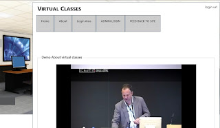
The Button control is used for performing action or generating events. There are two types of buttons are available in DOTNET library , First one is push button and another one is command Button. By Default you use push button if you want to make command button then assign some value to the command name property of the button. Button Control available in System.Web.UI.WebControl Class.
If you want to perform some action on button control then you must use Click event of the button. You can run your JavaScript code in DOTNET easily so If you want to perform client-side events on Button control then you must use OnClientClick property of the Button.
OnClientClick :   The Client-side script that is executed on a client-side OnClick

Example of Client side event and server side event

<%@ Page Language="C#" %>
<!DOCTYPE html>
<script>
    function Welcome() {
        alert("Welcome, Example of client side");
    }
</script>
<script runat="server">

    protected void Button1_Click(object sender, EventArgs e)
    {
        Response.Write("Example of Server Side");

    }
</script>
<html xmlns="http://www.w3.org/1999/xhtml">
<head runat="server">
    <title></title>
</head>
<body>
    <form id="form1" runat="server">
    <div>
        <asp:Button ID="Button1" runat="server" Text="Submit" OnClick="Button1_Click" OnClientClick="Welcome()"  />
    </div>
    </form>
</body>
</html>

Output
How to use Button Control in ASP.NET-Example of client side event
Your OutPut Shows that when you run your application first client side event will be executed after that run your server side event . According to Output diagram your client side code executed first  
<script>
    function Welcome() {
        alert("Welcome, Example of client side");
    }
</script>
After that when you press "OK" button then your Server side code executed.
 protected void Button1_Click(object sender, EventArgs e)
    {
        Response.Write("Example of Server Side");

    }

How to use Button Control in ASP.NET-server side event


How to use Scrolling in WPF: ScrollViewer Control

Most often times in the programming we don’t know about the size of the content to be displayed. The content may be fit in to the allotted area or may be larger than. That’s why in WPF there is a control i.e. ScrollViewer which can enable scrolling of those content whenever the content goes out to the display area.

ScrollViewer makes use of Scroll Bar controls and hooks them up to your content automatically. Just wrap your element in a Scroll Viewer to make it scrollable. I have used a textblock with large content (unfit to allotted area) in a stack panel as in following code in C# language:
<StackPanel>
<TextBlock Text="dotprograming is the latest group in the education field which gives accurate information about programming language"></TextBlock>
</StackPanel>

Run the WPF window and look out the result.

Text shown without ScrollViewer control in WPF

In the above image the content have been hidden and we can’t check the content without maximizing the window. But what about if the content is a paragraph. Now try the below code:
 <ScrollViewer HorizontalScrollBarVisibility="Auto">
<StackPanel>
<TextBlock Text="dotprograming is the latest group in the education field which gives accurate information about programming language"></TextBlock>
</StackPanel>
</ScrollViewer>

Run the project and check the result. A horizontal scrollbar has been enabled by the ScrollViewer control as in following image:

TextBlock enabled Scrolling with ScrollViewer control in WPF

The same process can be used when we want to enable vertical scrolling. Scrollbar visibility has four options to select by the user which are:
  • Visible—Scrollbar is always visible, whether it is needed or not.
  • Auto—visible if the content is big enough, hidden otherwise.
  • Hidden—always invisible but scrolling can be done using the arrow keys.
  • Disabled—always invisible and doesn’t exist.

How to open and close connections with ADO.NET

ADO.NET enables applications to connect to data sources and manipulate the data.  In ADO.NET object model, the data is retrieved through a data provider. An application can access data either through a dataset or a data reader.

You have to create a connection and then provide connection string, to move data between data source and an application. SqlConnection class is used to open a connection and also have some more methods:
  • ConnectionString: It is a property provides information like database name and data source.
  • Open (): used to open a connection. It Needs connection string to open a connection.
  • Close (): used to close an existing connection.
For example, the following code will create an object of SqlConnection class and then create a connection a connection string to the database in c# language.
SqlConnection connection = new SqlConnection();
connection.ConnectionString = “Data Source=(LocalDB)\v11.0;Initial Catalog=StockDb; Integrated Security=True”;

Here in the above code i have used the connection string of database name "StockDb". After you have defined the connection string, you need to open the connection by using open() method as written below
connection.Open();

Do all your work related to database and at the last you have to close the connection using close() method as written below
connection.Close();

How to use RadioButton Control in ASP.NET

The RadioButton Control

Similar to the CheckBox control , a RadioButton control creates a single radio button . The RadioButton control exists within the System.Web.UI.WebControls namespace . The RadioButton controls can be grouped, where only one RadioButton control can be selected at a time. In web forms, You have to set the RadioButton's GroupName property to the same value to associate them into a group.

Use of the RadioButton

  • Where you want to select only single item in given multiple items.
  • In BioData Forms you have to select gender
How to use RadioButton Control in ASP.NET

Public Properties of the RadioButton Class

GroupName : Obtains the name of the group to which radio button belongs.

Example of RadioButton Control in ASP.NET


<%@ Page Language="C#" %>

<!DOCTYPE html>

<script runat="server">

    protected void RadioButton1_CheckedChanged(object sender, EventArgs e)
    {
        result.Text = "You have Selected <br/>" + RadioButton1.Text;
        RadioButton2.Checked = false;

    }

    protected void RadioButton2_CheckedChanged(object sender, EventArgs e)
    {
        result.Text = "You have Selected <br/>" + RadioButton2.Text;
        RadioButton1.Checked = false;

    }
</script>

<html xmlns="http://www.w3.org/1999/xhtml">
<head runat="server">
    <title></title>
</head>
<body>
    <form id="form1" runat="server">
    <div>
        <h3>RadioButton Example

    </h3>
        <h3>Select The car you want to Buy</h3>
        <p>
            <asp:RadioButton ID="RadioButton1" runat="server" AutoPostBack="True" OnCheckedChanged="RadioButton1_CheckedChanged" Text="Maruti Zen" />
        </p>
        <p>
            <asp:RadioButton ID="RadioButton2" runat="server" AutoPostBack="True" Text="Honda City" OnCheckedChanged="RadioButton2_CheckedChanged" />
        </p>
        <p>
            <asp:Label ID="result" runat="server"></asp:Label>
        </p>

    </div>
    </form>
</body>
</html>

OutPut
How to use RadioButton Control in ASP.NET

Selasa, 27 Agustus 2013

How to use CheckBoxList Control in ASP.NET
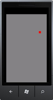
The CheckBoxList Control

you can use a CheckBoxList control to display a number of check boxes at once as a column of check boxes. The CheckBoxList control exists within the System.Web.UI.WebControls namespace. This control is often useful when you want to bind the data from a datasource to checkboxes . The CheckBoxList control creates multiselection checkbox groups at runtime by binding these controls to a data source.

Use of CheckBoxList Control

  • Where you find multiple options.
  •  In Shoping Site where you find sub category under category 
How to use CheckBoxList Control in ASP.NET

Example of CheckBoxList Control in ASP.NET 

<%@ Page Language="C#" %>

<!DOCTYPE html>

<script runat="server">
protected void CheckBoxList1_SelectedIndexChanged(object sender, EventArgs e)
    {
        string s = "Your selected books are<br/>";
        foreach (ListItem s1 in CheckBoxList1.Items)
        {
            if (s1.Selected)
            {
                s = s + s1.Text + "<br/>";


            }
        }
        result.Text = s;

    }

    protected void Page_Load(object sender, EventArgs e)
    {
     
    }
</script>

<html xmlns="http://www.w3.org/1999/xhtml">
<head runat="server">
    <title></title>
</head>
<body>
    <form id="form1" runat="server">
        <div >
Select Your Favorite books:<br />
            <asp:CheckBoxList ID="CheckBoxList1" runat="server" AutoPostBack="True">
                <asp:ListItem>ASP.NET </asp:ListItem>
                <asp:ListItem>WINDOWS FORMS</asp:ListItem>
                <asp:ListItem>WPF</asp:ListItem>
                <asp:ListItem>WCF</asp:ListItem>
                <asp:ListItem>JAVA SCRIPT</asp:ListItem>
            </asp:CheckBoxList>


        </div>
        <asp:Label ID="result" runat="server"></asp:Label>
    </form>
</body>
</html>


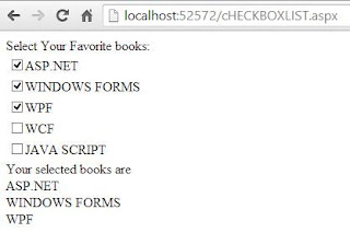
Output
How to use CheckBoxList Control in ASP.NET

This example shows that you can choose multiple item in given list. Here foreach loop is running from starting index to ending imdex. When you select ASP.NET book item in the given list then your item will appear on the Label control under the CheckBoxList. If you again select Windows Forms Book in given list , PostBack will occurs and your result will appear on Label Control with previous result.   

Senin, 26 Agustus 2013

Print Image using PrintDialog Box

To print images in windows forms Graphics class and its various methods are used. Graphics class provides methods for sending objects to a device such as printer. Add a printDocument,  printDialog and a button to the windows form application.

In the code behind file create an object of Bitmap class which will be used to create an image. Write a function to capture the screen to be printed just like written in the below code:
private void CaptureScreen()
{
Graphics graphics = this.CreateGraphics();
graphics.DrawRectangle(Pens.Black, 50, 50, 300, 100);
image = new Bitmap(300, 300, graphics);
Graphics g = Graphics.FromImage(image);
g.CopyFromScreen(this.Location.X, this.Location.Y, 0, 0, this.Size);
}
In the above code a rectangle will be drawn at the given location. CopyFromScreen() function used to performs a bit-block transfer of the color data, corresponding to a rectangle of pixels, from the screen to the drawing surface.

In the click event of code write the following code:
CaptureScreen();
printDocument1.PrintPage += printDocument_PrintPage;
printDialog1.Document = printDocument1;
DialogResult res = printDialog1.ShowDialog();
if (res == DialogResult.OK)
printDocument1.Print();
The above code is somewhat same to the code used in printing text except the calling of CaptureScreen() method.

Print page event of print document should be look like:
void printDocument_PrintPage(object sender, PrintPageEventArgs e)
{
e.Graphics.DrawImage(image, 50, 100);
}

Run the project and click on print button. On the print Dialog box click on ok with selected printer and it will print whatever is on your screen at the given points. When I print this then it had printed as the following image:

Print image using PrintDialog Box
See also: Printing Text

PrintDialog Box Control in Windows Forms

To print any text or image, print Dialog box is used which is in-built control in windows forms. To invoke the default print dialog box, you need to either add the PrintDialog and PrintDocument control from the toolbox or create an instance of the same classes. The following image shows the default Print Dialog box.

PrintDialog box Control in windows forms

Printing Text

In this topic we will print the text from textbox to the printer attached with the computer. Just add a textbox and a button to the form.

Printing text form preview in windows forms

The click event of button should be look like the following code in C# language:
private void button1_Click(object sender, EventArgs e)
{
printDialog1.Document = printDocument1;
DialogResult res = printDialog1.ShowDialog();
if (res == DialogResult.OK)
printDocument1.Print();
}
Now when we check out the above code, text to be print is not specified there. To specify the text to be print printPage event of print document is used. The print page event will be:
private void printDocument1_PrintPage(object sender, PrintPageEventArgs e)
{
e.Graphics.DrawString(textBox1.Text, new Font("Tahoma", 25), Brushes.Black, 150, 20);
}
Here above the drawstring method draws the specified text at the given location with given properties. If we don’t want to add print dialog and print document from the toolbox then we have to instantiate both of the classes in our code. Just write the following code (C# language) in the click event of button:
PrintDocument pd = new PrintDocument();
pd.PrintPage += pd_PrintPage;

PrintDialog printDialog = new PrintDialog();
printDialog.Document = pd;

DialogResult res = printDialog.ShowDialog();
if (res == DialogResult.OK)
pd.Print();
The second line in above code will be used to generate the printPage event of printDocument. The code of this event will be the same as written first.
Run the project and write something in the textbox e.g. “Print Example”. It will print a page written the above text on the location given above.
There are some properties of the printDocument class, some of which are DefaultPageSettings, PrinterSettings, DocumentName, PrintController and etc.

See also: Print Image using Print Dialog

FolderBrowserDialog Control in Windows Forms

Browse for folder dialog box is used to select a folder to save or open a file. Most often you may need to select a particular folder to open or save a file in windows based application. It enables user to select any folder on system and to retrieve the path of a folder selected by the user.
Following image shows the Browse for Folder dialog box:

This dialog box is similar to open file dialog box except that it enables user to work with folders. To show this type of dialog box just add Folder Browser Dialog box from toolbox or create an object of this class.

Write folderBrowserDialog1.ShowDialog(); in the click event of button.

To open the default browse for dialog box write the following code in the click event of a button:
private void folderBrowse_Click(object sender, EventArgs e)
{
FolderBrowserDialog folderBrowserDialog = new FolderBrowserDialog();
folderBrowserDialog.ShowDialog();
}

See also: OpenFileDialog Box Control

Minggu, 25 Agustus 2013

How to use CheckBox Control in ASP.NET

Introduction
The Checkbox control creates a check box that can be selected by clicking it. The control exists within the System.Web.UI.WebControls namespace. The Checkbox control displays checkmarks that allow the user to toggle between a True or False condition.

Public Properties of the Checkbox Class
AutoPostBack : Obtains a value showing , if the CheckBox state automatically post back to the server when clicked or not.
Checked : Obtains a value showing , if the CheckBox control is checked or not.
Text : Obtains the text label associated with the CheckBox control.

Example of CheckBox control in ASP.NET

<%@ Page Language="C#" AutoEventWireup="true" CodeFile="Default.aspx.cs" Inherits="_Default" %>

<!DOCTYPE html>

<html xmlns="http://www.w3.org/1999/xhtml">
<head runat="server">
    <title></title>
</head>
<body>
    <form id="form1" runat="server">
    <div>
    <h2>CHECKBOX EXAMPLE</h2>
        <br/>
        <asp:CheckBox ID="CheckBox1" runat="server" AutoPostBack="True" OnCheckedChanged="CheckBox1_CheckedChanged" Text="Apple" />

        <br />
        <asp:CheckBox ID="CheckBox2" runat="server" AutoPostBack="True" OnCheckedChanged="CheckBox2_CheckedChanged" Text="Mango" />

    </div>
        <asp:CheckBox ID="CheckBox3" runat="server" AutoPostBack="True" OnCheckedChanged="CheckBox3_CheckedChanged" Text="Orange" />
        <br />
        <br />
        <asp:ListBox ID="ListBox1" runat="server" Height="145px" Width="112px"></asp:ListBox>
    </form>
</body>
</html>

Codebehind Code
using System;
using System.Collections.Generic;
using System.Linq;
using System.Web;
using System.Web.UI;
using System.Web.UI.WebControls;

public partial class _Default : System.Web.UI.Page
{
    protected void Page_Load(object sender, EventArgs e)
    {

    }
    protected void CheckBox1_CheckedChanged(object sender, EventArgs e)
    {
        if (CheckBox1 .Checked==true)
        {
            ListBox1.Items.Add(CheckBox1.Text);

         
        }
        else
        {
            ListBox1.Items.Remove(ListBox1.Items.FindByText(CheckBox1.Text));
        }

    }
    protected void CheckBox2_CheckedChanged(object sender, EventArgs e)
    {
        if (CheckBox2.Checked == true)
        {
            ListBox1.Items.Add(CheckBox2.Text);


        }
        else
        {
            ListBox1.Items.Remove(ListBox1.Items.FindByText(CheckBox2.Text));
        }

    }
    protected void CheckBox3_CheckedChanged(object sender, EventArgs e)
    {
        if (CheckBox3.Checked == true)
        {
            ListBox1.Items.Add(CheckBox3.Text);


        }
        else
        {
            ListBox1.Items.Remove(ListBox1.Items.FindByText(CheckBox3.Text));
        }

    }
}
Output
How to use CheckBox Control in ASP.NET
This example shows when you select any one checkbox which is taken in this example then your checkbox Text add to the ListBox . If you unselect it then remove Text from the list.Because AutoPostBack property is working here.
ListBox1.Items.Remove() : If you want to remove item from list then use remove method of the list.
ListBox1.Items.FindByText() : If you want to search any item from the list then use FindbyText() method.

Sabtu, 24 Agustus 2013

XNA : How to show Image in Windows Phone Game

Step-1 : Right below the SpriteBatch spriteBatch ; line , add the following :

GraphicsDeviceManager graphics;
        SpriteBatch spriteBatch;
        Texture2D texture;
        Rectangle current = new Rectangle(40, 40, 100, 75);
These are all the variables you will need for the show image in window Phone game , here is a quick breakdown:
texture : The Texture2D class holds a two dimensional image . We will define a small texture in memory to use when drawing the image.
current : The XNA Framework defines a structure called Rectangle that can be used to represent an area of the display by storing the x and y position of the upper left corner along with a width and height.


Step-2 : Add the following code to the LoadContent( ) method after the spriteBatch initialization:
spriteBatch = new SpriteBatch(GraphicsDevice);
            texture = Content.Load<Texture2D>(@"squ");
Here:
1. Download image from internet
2. Save the image as squ.bmp in a temporary location.
3. Back in visual c# Express , Right-click on WindowsPhoneGame1Content (Content) in solution Explorer (You may need to scroll down to see it) and select Add | Existing item.
Browse to the image you downloaded and click on ok.

Step-3 : Add the following code after the call to clear the display

GraphicsDevice.Clear(Color.CornflowerBlue);

            // TODO: Add your drawing code here
            spriteBatch.Begin();
            spriteBatch.Draw(texture, current, Color.Red);
            spriteBatch.End();


            base.Draw(gameTime);


Output

XNA : How to show Image in Windows Phone Game

Source code :


Jumat, 23 Agustus 2013

Virtual class room project in ASP.NET

Introduction 
A virtual class can conduct online classes by some tutors.Virtual class is a way of representing logical education.
Project contain facilities
  • Add new students 
  • Online payment
  • Admin panel
  • Tutor panel
  • Add new Tutor with tutor-id
  • Session tracking
  • Feed back System
  • Student Query generation 
Add New Student module: In which we can add new student with student profile such as student name , Student college name , payment detail etc.
Admin panel : In which a administrator can hold all activity such as : Add new tutors , Approve tutors , Approve students detail , monitor work done by tutor etc.
Tutor panel : A tutor can upload files within in current time.Solve queries generated by students using FAQ

Requirement of the application

  • Visual Studio 2010 
  • SqlServer 2008
How to run your Application 
First you need to fulfill requirement which is above mentioned. After that open your website in visual studio 2010 and run your application.
Steps for Executing your application
  • First register in Student panel
  • Second register in Admin panel and approve student which is currently registered
  • Add new tutor
  • Assign tutor-id to tutor
  • Login in tutor panel also login in student panel
  • Add files using upload facilities in tutor panel
  • check files in student panel
Virtual class room project in ASP.NET


Your project will submit after 5 hour 

FileDialogBox control in Windows Forms

It is an abstract class, therefore we cannot instantiate it directly. We can use OpenFileDialog or SaveFileDialog to open a file or to save a file respectively. Just run the open or save dialog boxes is not sufficient to open or save a file, we have to use I/O streams to do these simple tasks.

OpenFileDialog

To open an existing file and see the content of that file, OpenFileDialog box is used. It is same in all window application as shown in following image:

OpenFileDialog Box Control in windows forms

To open this dialog box just add an open file dialog control from toolbox and write openFileDialog1.ShowDialog(); in the click event of button.

SaveFileDialog 

To save a file after creating of modifying you have to save that file using SaveFileDialog box at the specified location. Following figure shows the preview of SaveFileDialog box.

SaveFileDialog Box Control in windows forms

To open this dialog box the same procedure will be followed up. Just add a SaveFileDialog and write saveFileDialog1.ShowDialog(); in the click event of button.

To open these type of dialog boxes we have to create an object of respective class and then call its ShowDialog() method:
OpenFileDialog openFileDialog = new OpenFileDialog();
openFileDialog.ShowDialog();

FolderBrowserDialog Box Control

Font Dialog Box Control in Windows Forms

While working on windows-based application, you might have to change the font size, style or related to font. Just like MS-Word there should be a font dialog box to differentiate some text from common text in the file. This can be done using Font Dialog box shown in following image:


To add this box just drag-n-drop font dialog control from the toolbox. Add a textbox and a button on the form with text property “change font”. Button will used to show the font dialog box and then all the changes made in dialog box will appear in the text box.

By default a textbox has Microsoft Sans Serif as font, Regular as font style and 8 as font size. Now change these values as
  • Font = Monotype Corsiva
  • FontStyle = Bold
  • FontSize = 12
from the font dialog box and then click on ok button. We can see the text has been changed in our textbox as in following diagram.


Following code has to be written in the click event of button to perform these simple task:
private void changeFont_Click(object sender, EventArgs e)
{
fontDialog1.ShowDialog();
textBox1.Font = fontDialog1.Font;
}

FileDialogBox Control

ColorDialogBox Control in Windows Forms

Common dialog class is the base class for displaying common dialog boxes. One can access these boxes like Font dialog box, Open dialog box, Print dialog box etc. by using inherited classes of this base class. All these inherited classes overrides RunDialog() method which is automatically called when user calls the ShowDialog() method.

Color Dialog Box

To change the color of anything you want like text color, background color or foreground color of any control dynamically, we can use color dialog box. A simple look on color dialog box:

Preview of color Dialog Box

To add this box just drag-n-drop color dialog control from the toolbox. Add a textbox and two buttons on the form with text property background and foreground respectively as shown in the following image:


Write the following code snippet (C# language) in click event of both button respectively:
private void backgroundButton_Click(object sender, EventArgs e)
{
colorDialog1.ShowDialog();
textBox1.BackColor = colorDialog1.Color;
}
private void foregroundButton_Click(object sender, EventArgs e)
{
colorDialog1.ShowDialog();
textBox1.ForeColor = colorDialog1.Color;
}
Now look out the text box, it have been changed its background color to and also foreground color as shown in following image.


So it is so easy to change color of any control’s background or foreground property.

FontDialogBox Control

Error Provider Control in Windows Forms

When using validation, programmer should have notify a message if there is a problem with the input entry. That notification can be shown using message box, status label control etc. The one more control to notify an error message to user is error provider control.

Error provider control can be used to display an error message, whenever the user positions the mouse pointer over the error icon. To add an error provider control, you can drag-n-drop it from the toolbox to the form. Some of the properties of this control are:
  • BlinkStyle: whether the error icon blinks or not when an error is set.
  • BlinkRate: rate at which the error icon blinks.
  • ContainerControl: contains the controls on which this control can display icons.
Here are some methods which are mostly used with error provider:
  • Clear(): clear all the errors associated with it.
  • GetError(): returns current error string for the specified control.
  • SetError(): set the error for specified control.
To set an error for a textbox when user left empty, drag-n-drop a textbox, button and an error provider control on a form. On the click event of button write following code in C# language:
if (textBox1.Text == string.Empty)
{
textBox1.Focus();
errorProvider1.SetError(textBox1, "This may not be Empty");
}
When we run the form and click on the button without writing anything in the textbox, then an error icon will blink just after the textbox with a message shown as a tool tip of the icon.

Error provider control in windows forms C#

Here in the code a method SetError() have been used, it takes two parameters, one for the control (to which error will be associated) and the second for the message to be shown. A single error provider can easily be used with more than one control.

Kamis, 22 Agustus 2013

XNA Game : SquareChase

The Basic Aim of the Game
In SquareChase , we will generate randomly positioned squares of different colors while the user attempt to catch them with their mouse pointer before they disappear .

System requirements of the project
First you need to install visual c# 2010 and XNA framework extensions.Your system has support graphics card (Shader Model 1.1 Support, Direct X 9.0 support)

How to design the game
First you need to initialize the graphics object in your XNA Game class constructor.

graphics = new GraphicsDeviceManager(this);
Content.RootDirectory = "Content";

Make the mouse pointer visible by adding the following before the call to 

base.Initialize();

this.IsMouseVisible = true;

here is the one override Initialize()  method is to call LoadContent() when the normal initialization has completed. The method is used to read in any graphical and audio resources your game will need.

Screenshot of the game
XNA Game : SquareChase

Project Source code


Rabu, 21 Agustus 2013

Status Strip Container Control in Windows Forms

StatusStrip container control is used to display objects that are on the current form and also to provide feedback on the progress of any progress of any operation being performed by the form. Some of the properties of this container control are:
  • Items: collection of items to be displayed on the control.
  • LayoutStyle: specifies the layout orientation of the control.
  • Dock: defines the border of control which will bind to the parent control.
Status strip control contains four child controls that can be placed as and when required. The child controls are:

Status Label Control

Works as a Label control. Used to display status information and prompt the user for a valid entry. It has some properties to be used by programmer like
  • Text: text to be displayed on the control.
  • Spring: whether the item fills up the remaining space or not. It is a Boolean type property.
  • TextAlign: specify the alignment of the text.

ProgressBar Control

Used to show the status of the task performing by the user. Represent window progress bar control. Some properties of this control are:
  • Minimum: lower bound of the range.
  • Maximum: upper bound of the range.
  • Value: current value to be set on this control.
  • Step: value to be increment/decrement.

DropDown Button Control

Displays toolStripDropDown from which user can select one item at a time. Generally used when the items to be displayed on StatusStrip cannot be accommodated. Some of the properties of this control are:
  • DisplayStyle: whether the text or image to be displayed.
  • DoubleClickEnabled: whether the double click event will occur.
  • DropDownItems: specifies the toolStripItem when the item is clicked.

SplitButton Control

It is a combination of a standard button and a drop-down button on the left and right respectively. Some of the properties are:
  • DisplayStyle: whether the text or image to be displayed.
  • DoubleClickEnabled: whether the double click event will occur.
  • Padding: internal spacing within the item.
The following image shown all the four controls of the StatusStrip control.

StatusStrip Container control in windows forms

Error Provider Control

Selasa, 20 Agustus 2013

ASP.NET : How to use Link Button control

The LinkButton control is another standard Web server control used to link the current Web page to some other Web page, similar to the HyperLink control. The only difference between the two is that the HyperLink control just allows the browser to navigate to a new Web Page, whereas in the LinkButton control, we can also perform some other action by handling the click and Command events of this control.

Use of the LinkButton control

  • Best use in Signin/Signout button
  • Design horizontal/vertical menu bar 
  • In bulleted list 
  • Define product category
Snapshot of the link button control
Account setting link button

SignOut Example of LinkButton

<%@ Page Language="C#" %>
<!DOCTYPE html>

<script runat="server">

    protected void LinkButton1_Click(object sender, EventArgs e)
    {
        Session.Abandon();
        Response.Redirect("Default.aspx");
    }
</script>

<html xmlns="http://www.w3.org/1999/xhtml">
<head runat="server">
    <title></title>
</head>
<body>
    <form id="form1" runat="server">
    <div>
        <asp:LinkButton ID="LinkButton1" runat="server" OnClick="LinkButton1_Click">SignOut</asp:LinkButton>
    </div>
    </form>
</body>
</html>

Output
signout link button

Senin, 19 Agustus 2013

Passing Values from DataGridView between Different Forms

Sometimes we need to transfer all the rows and columns of a DataGridView from one form to another. In this article I will transfer all the binded data of first form's grid view and bind them to second form's grid view.

Create two forms with dataGridView in each and a button on first form. Create a class to which your datagridview will bind like i create a student class having Name, Age and address field.

Bind the first form's gridview in C# language as
studList.Add(new Student() { Name = "Jacob", Age = 23, Address = "London" });
studList.Add(new Student() { Name = "Jaklin", Age = 25, Address = "US" });
studList.Add(new Student() { Name = "Julia", Age = 26, Address = "UK" });
dataGridView1.DataSource = studList;

In the click event of button write the following code in C# language
List<Student> tempList = dataGridView1.DataSource as List<Student>;
new Form1(tempList).ShowDialog();

And your second form's constructor have to look like the below code in C# language
public Form1(List<Student> sourceList)
{
InitializeComponent();
dataGridView1.DataSource = sourceList;
}
When we run this project and click on transfer button then both the form have same list of data e.g.

So we have passed all the rows and columns of first form's gridview to second form's gridview.